

Sunny Ideas For Your Home With a Fresh Spring Color Palette
I love creating a seasonal home with color. It’s always changing, with its own mood and personality. There’s a spiritual rhythm to the seasons and it seems to put us in proper balance. The changing seasons prepare our hearts and homes for what’s next. Turning to nature for inspiration and living more intentionally with the seasons is a great way to liven up your space by taking cues from the changing colors of the seasons. It just feels right.
You’ve heard me talk about the importance of color in my other posts and it continues to be a popular topic. Today, I’m sharing my favorite seasonal color palettes for Spring sprucing up. I’m also including 5 impactful ways to add these softer colors to the home, from simple touches to big updates that will transform your space and prepare your hearts and home for rituals of Spring renewal!
A Sunny Forecast is in the Making With These Softer Palettes For Your Next Spring Refresh

Start With a Clean Canvas
When you start with a clean canvas, it allows everything to take shape and evolve. It’s a subtle and refined way to transform your space. BM “Baby Fawn'' is a gentle, warm white with a flesh pink undertone and quite complimentary when mixed with soft, historic palettes. C2 Paint “Slinkey” is another great option for starting out fresh. According to the color chemists at C2 Paint, this color is “Subtle and warm - this sterling pastel blue moves easily between modern and classic architectural styles.”

BM “Baby Fawn”

C2 Paint “Slinkey”
Begin with a Color Palette You Love Along With a Gentle Reminder From Nature
Picking paint colors can be difficult, but if you start with what you love and use the seasons as your axis, you’ll be instantly inspired. Spring is a great time to start fresh. Keep your palette light and mix in lots of hues to add character and personality to your home, and let the season guide you.
Pink is a fascinating color that offers lots of flair and glamour to a space. It’s lively and radiant but can be very soothing at the same time and can make an unexpected statement. For a burst of Spring try, C2 Paint “Pillow Talk” or BM “First Light”. These two colors are luscious!

Designer Corey Damen Jenkins
Color Is The Spice of Life
A little pop of color is always good in unexpected places. Dare to go bold! Play with colors & patterns to convert your home into a vibrant oasis.

Designer Audrey Interiors Photography Julia Dags
Adding Color Through Accents and Accessories is Less Intimidating
These David Austin Pilgrim roses arrived early last Spring. They set the tone for a warm and welcoming garden party with all their luminosity, sunny warmth and optimism.
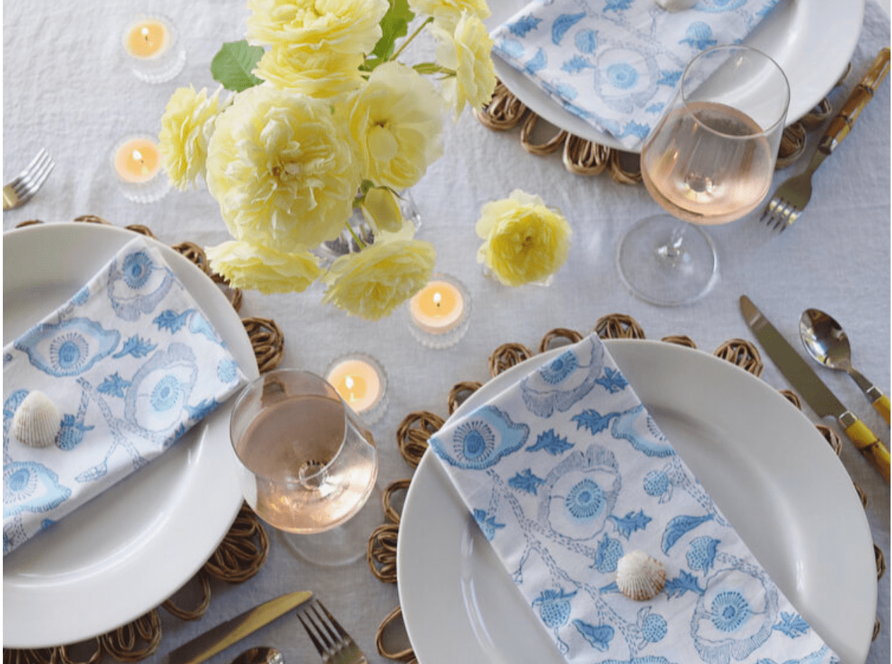
Designer Audrey Interiors
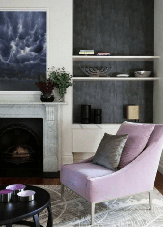
Adding a touch of yellow with this velvet armchair from One Kings Lane would be lovely anytime of year, especially during the sunny seasons of Spring and Summer. Accent pillows in hues of yellows would be a great way to refresh your home with brighter, bolder colors and with less of a commitment to the color. Creating rooms with soft amber velvets work beautifully in every season and partner well with yellow silks, and warm woods. Tie it all together with a few of your favorite brass accents.

For a richer yellow with slightly warmer tones, use BM “Summerdale Gold”. This is a very sophisticated yellow. Muted, golden shades are timeless and elegant. BM “Summerdale Gold” is an historic yellow with a feeling of warmth, not quite as gentle and cheerful as C2 Paint “Limerick’s” soft hue. I would suggest using it in a small space for a big impact. Offset it with a beautiful white wall like BM “White Swan'' for a luminous glow. Keep in mind, these colors aren’t just for walls and trim. Painting an old dresser a vibrant yellow to store your linens, might just make the everyday mundaneness of folding and storing your linens become your favorite chore!

BM “Summerdale Gold”
Trust Yourself!
Instead of following trends, discover what’s right for you and tell your own color story. Keep your home classic and timeless. Most importantly, your home should reflect you. Color might be a trend now, but if you love color, then that is timeless for you. Color is lovely - it personalizes your home. Lavender hues are a great way to accessorize for Spring. Add pillows, throws, or just with a lush bouquet of lilacs. Pair C2 Paint “Bella Donna” with grays and a hint of black and some shimmer to neutralize the space.
Designer Emily Henderson

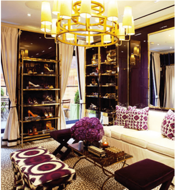
Courtesy of Tory Burch
Spring is a season filled with vibrancy and energy and one that is waited for with such hope and anticipation. Remember to keep your palette fresh and light. If you need help telling your color story, or wondering how to liven things up in your home, book a Color Consultation with us. We would love to help you do color right.
Warmly,
Audrey
PS: Wherever you are in life, remember to make your home the best it can be.